We now have mortality data for the first few months of 2020 for many countries, and, as you might expect, there were steep increases associated with the beginning of the COVID-19 pandemic in each one.
Surprisingly, however, these increases did not begin before the lockdowns were imposed, but after. Moreover, in almost every case, they began immediately after. Often, mortality numbers were on a downward trend before suddenly reversing course after lockdowns were decreed.
This is an astonishing finding. But before I discuss its full import, and pose some questions to those who still defend the utility of lockdowns, I want to present the data that proves it.
Here’s a series of charts by the Financial Times showing overall mortality and “deaths in excess of normal levels” in 2020 for a number of countries:
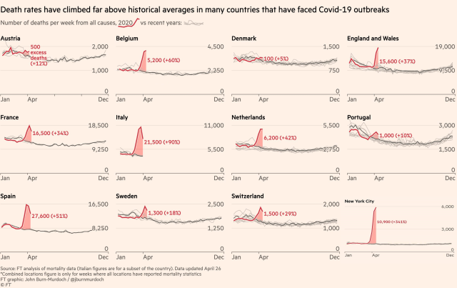
As you can see, in every country there were significant increases in overall mortality beginning some time in February or March.
Now let’s add the lockdown dates in green for each country:
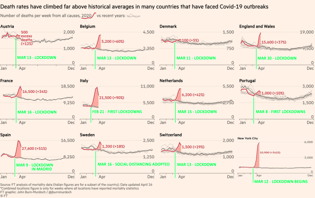
You will notice that only after each country (or city) was locked down did the increases begin. Moreover, they began immediately, and in nearly every case, precipitously.
Now let’s examine the data for a few of these countries and cities in greater detail.
Belgium
The Economist has published its own series of charts showing excess deaths in several countries. Here’s its chart for Belgium:

The national lockdown is shown to have occurred on March 18th. But that was only Phase 2 of the national lockdown. Phase 1, which included widespread business closures, began on March 13th.
Their chart, therefore, should really look like this:

Which shows no increase in mortality before the lockdown, and then an immediate and precipitous increase after it was imposed.
The Netherlands
Here’s The Economist’s chart for the Netherlands:

In a strange oversight, the lockdown that was declared on March 15 in that country is not indicated here. Moreover, the March 23rd “ban on public gatherings” shown in the chart was simply the bolstering of an already-existing ban on public gatherings that had been issued on March 12 (which was accompanied by the lockdown of nursing homes). The Dutch lockdown, therefore, began on March 12, escalated on March 15, and peaked on March 23.
Let’s add that information to the chart:

Once again, we see no significant increase in mortality before the start of the lockdown, and then an immediate, precipitous increase once the lockdown began.
(Note: The slightest increase in mortality is still observable immediately before the “Lockdown phase 1” line, but that is probably due to the fact that the Netherlands reports its mortality data on a weekly, rather than a daily basis, and March 12th (“Lockdown phase 1”) fell in the middle of the week. If we had daily data, we would probably be able to confirm that there was no increase at all prior to March 12th.)
Spain
Let’s move on to some larger countries.
Here’s The Economist’s chart for Spain:
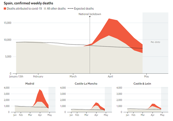
Note that most of the excess deaths came from the Madrid region.
Here’s a chart I made of overall mortality in the Madrid region using the same data The Economist used (available here). Notice the steep rise in deaths beginning around March 9th:
